This week: yearly charts, performance stats, and volatility, credit spreads, earnings, tech stocks, investor sentiment, market valuations, and a weird alternative indicator.
Learnings and conclusions from this week’s charts:
- The S&P500 closed 2024 up 23.3% (25% including dividends).
- This put US large caps on top (vs other assets) in 2024.
- This was accompanied by lower average volatility + higher earnings.
- As such, investor sentiment notched up new bullish record highs.
- And valuation indicators moved further into expensive territory.
Overall, it was a year that featured all the hallmarks of a raging bull market. But heading into 2025, expectations are running hot, and the hurdles for a third calendar year in a row of 20%+ gains are high. As I discuss, it’s possible that the bull market keeps keeping on higher for longer, but we need to think about probabilities vs possibilities.
1. Happy New Year!
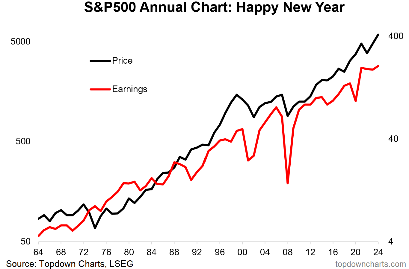
The closed 2024 up a solid 23.3% for the year (25% including dividends). The version closed up a still respectable but much lower 10.9% (13% including dividends). As the annual chart below shows, the S&P 500 closed a touch below the year’s daily closing high, and comfortably above the year’s low.
Source: Topdown Charts
2. Return Rankings
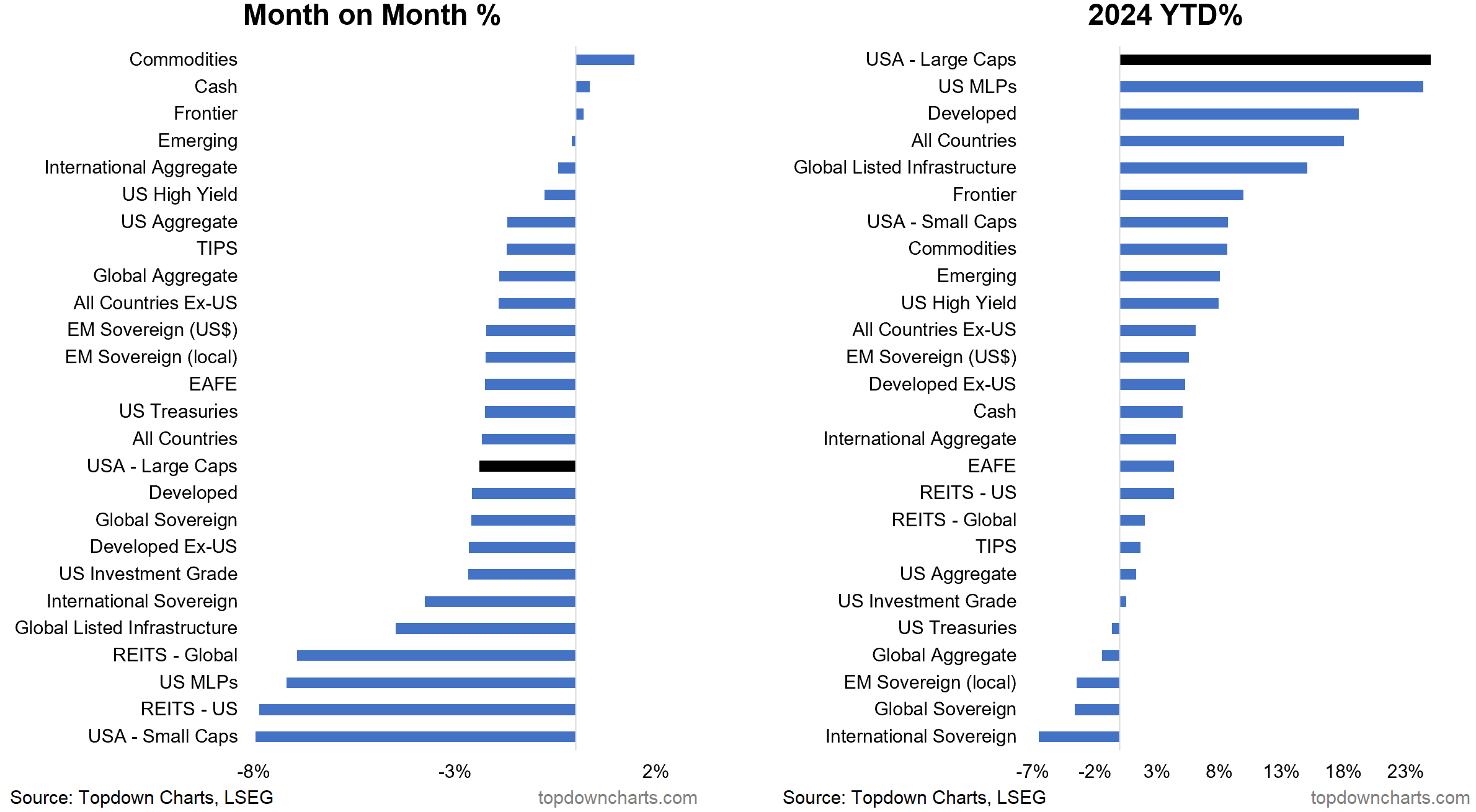
While the S&P 500 (US Large Caps) lost ground on the month in December, it was at the top of the table of mainstream asset classes; well ahead of EM/Frontier/Developed equities, small caps, cash, commodities, and particularly strong vs negatively returning treasuries.
Source: Asset Class Returns
3. The Year in VIX
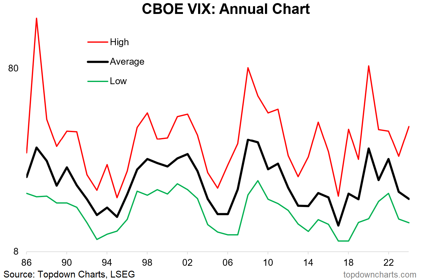
As for the , despite a significant but short-lived flare-up in early-August (following the BOJ rate hike and 25% crash in Japanese stocks), the average closing VIX value during the year was lower in 2024 vs 2023 — and continued the clearly cyclical trend of calming. Eventually, this cycle will turn back up again, but for now we are moving further through the calming phase.
Source: Topdown Charts Professional
4. VIX vs Credit Spreads
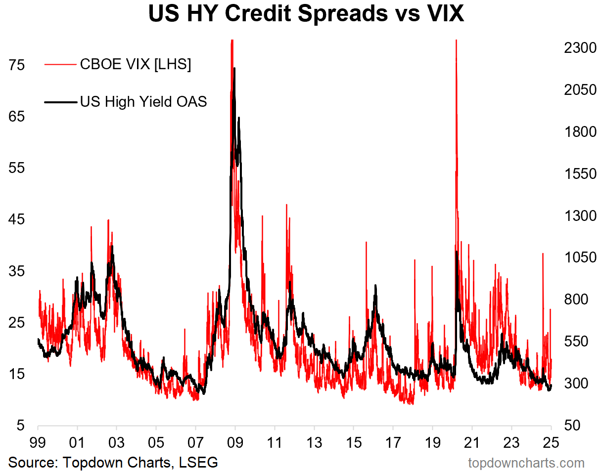
And it wasn’t just the VIX, US high yield credit spreads (aka junk bonds) squeezed down to a 17-year low, shocking both in terms of the headline but also in realizing that the financial crisis was 16-years ago! On a serious note this is getting into complacency territory: very little credit risk premium on offer here.
Source: Credit Spreads at 17-Year Lows
5. Price vs Earnings
It would be incomplete to only show price, so here’s a check on how earnings have moved. Earnings certainly improved during the year (see why/how on the next chart), but as we’ll see later in the pack — price moved higher than earnings. in other words, valuation multiples increased (and from already high levels).
Source: ChartStorm – Perspectives Pack
6. Tech vs Non-Tech Earnings
The key driver behind earnings growth in 2024 was tech stocks (TMT = Technology, Media, Telecommunications). Interestingly TMT over the past couple of years has been the key driver both up and down, and we should expect further downside episodes like that in the future as TMT companies mature and become increasingly cyclical.
Meanwhile, non-tech earnings have gone sideways for 3 years. It leaves me wondering which of these two lines have the most potential to surprise (up or down) — the bear case would be TMT catch-down, the bullish rotation case would be non-tech catch-up.


